
 KOR
KOR
CI Concept

“New take off as KG Chemical”
We’d like your unstinting support and encouragement to our future growth and development.
CI (Symbol Mark & Logo Type)
-
-
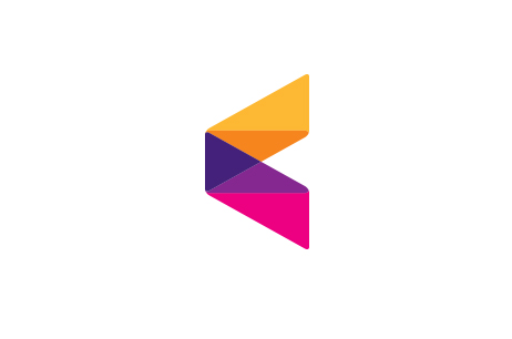
Corporate symbol
KG symbol is in the shape of a prism. When light passes through a prism, it spreads out in a wide spectrum.
In other words, prism defines KG, and various colors displayed through spectrum reveal the vision of KG creating various values of the world, Also, a prism is in the most stable triangular shape. It resembles the inside of KG with faithful basics and firm beliefs.
-
-
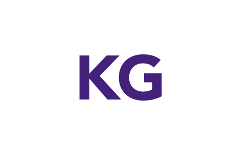
Logo type
The logo of KG is in regular gothic font. By eliminating unnecessary curves that dazes viewers, it symbolizes the truth of KG that reveals its unaffected self.
Subsidiary names are located in smaller fonts than KG on the right hand side, This represents the organic relationship between subsidiaries united by KG And this is why subsidiaries of KG are called one family.
Color System
-
KG
Royal PupleColor Chips
Pantone 268CProcess Color
C85 M100 Y10 K20 -
KG
VioletColor Chips
Pantone 2602CProcess Color
C57 M100 Y0 K0 -
KG
MagentaColor Chips
Pantone 216CProcess Color
C0 M100 Y10 K0 -
KG
OrangeColor Chips
Pantone 158CProcess Color
C0 M60 Y100 K0 -
KG
YellowColor Chips
Pantone 130CProcess Color
C0 M30 Y90 K0